Transform Your Space with These 8 Trim Colors That'll Make Your Guests Do a Double Take!
Boost your home's design game with these simple but impactful trim color choices.

While white has long been the go-to for trim, it's time to step away from the expected and explore some daring alternatives. Whether you're refreshing the baseboards, moldings or window frames, why not break from tradition and use trim to make a statement?
Choosing the same color for both walls and trim can create a sleek, jewel-box vibe. Or, for a true wow factor, pair a vibrant trim color with bold wallpaper or contrasting walls to really turn heads. If you're ready to take the leap, here are eight trim color ideas to elevate your space from blah to bold!
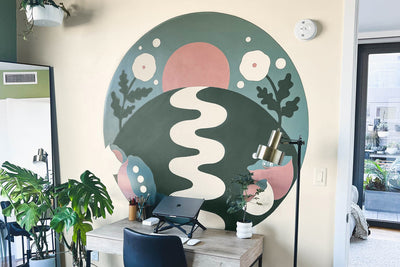
 @elleehome
Blackest
When you think of contrast, black and white always shine. For a modern twist, replace brown wood trim with Blackest. This color pairs beautifully with white walls and highlights intricate moldings, giving even worn-out wood doors a fresh new look. A timeless and versatile choice, black trim will complement just about any style.
 @linenandbasil
Irony
If you want to add drama without going full-on black, Irony is your go-to. This rich, dark gray has just the right amount of depth. It's perfect for bringing cohesion to mismatched wood features in your home, and its semi-gloss finish ensures that every little detail pops.

@prettyonfridays
Greige
A perfect blend of gray and beige, Greige adds warmth and sophistication to your trim, offering a refreshing alternative to the typical white. It works beautifully on ornate woodwork, paneling and other architectural details with texture and character.

@ashleyswhiteside
Goodnight Moon
For a bold, editorial touch, try Goodnight Moon, a deep, captivating navy. This striking color works wonders when used on both walls and trim, especially in spaces filled with natural light. The uniformity it creates adds visual interest while remaining subtle and versatile, perfect for any room, even your bathroom!

@ashleyswhiteside
Grayish
A soft, tranquil shade like Grayish offers the serenity of a pale green hue, creating a calming environment for any space. Try pairing it with our Money Moves wall color for a truly dreamy effect just like designer Ashley Whiteside did. The monochromatic look gives the room a sense of flow and makes ceilings appear higher.

@hardinsonhighstreet
Meet Cute
Meet Cute is a romantic, rosy shade that's perfect for a bedroom filled with personality. This color is soft and sweet, and it adds a touch of warmth without overwhelming the space.

@jonaevilleneuve
Field Trip
For a rich, nature-inspired vibe, Field Trip brings the beauty of the outdoors right into your home. This deep forest green is perfect for bathrooms, where its soothing tone creates a serene, woodland escape. Add a touch of whimsy with a printed wallpaper for the ultimate fun, nature-infused retreat!

@follow.us.home
Flatiron
A warm, dynamic blend of gray and beige, Flatiron looks stunning in a dining room. It catches the light of the day and deepens as evening falls, creating a cozy, inviting atmosphere perfect for dinner parties and intimate gatherings.
Tags:
We make paint shopping simple with curated colors, zero VOC paint and everything you need to create a home you love, delivered.