

Set In Stone
- $77 Gallon
- $3 Swatch
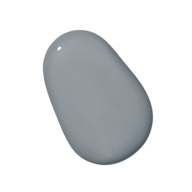
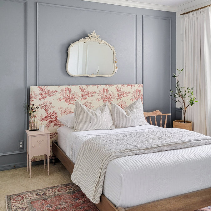
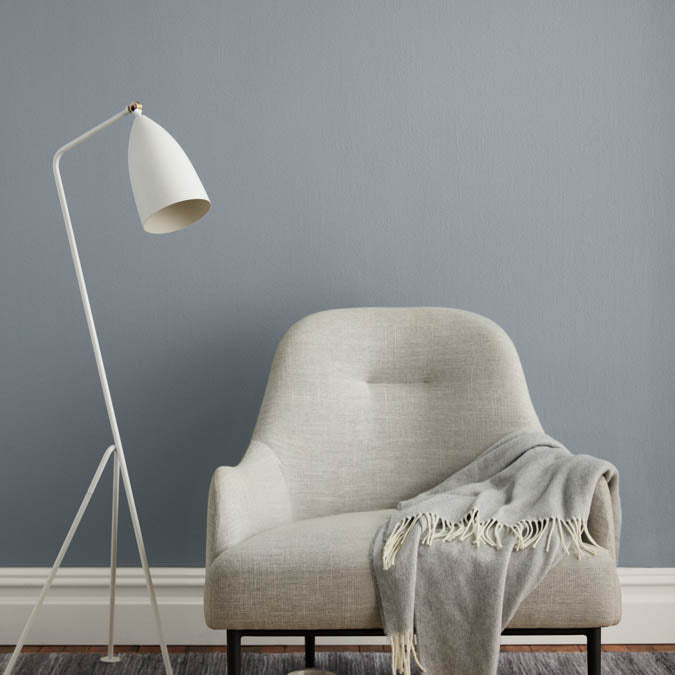
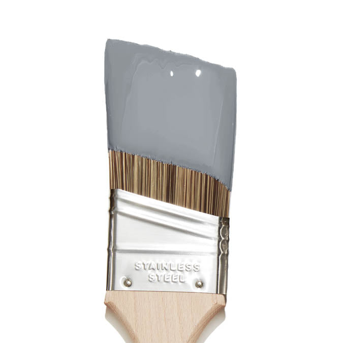
There’s nothing wishy-washy about this strong, cool gray. With subtle blue undertones and a modern feel, it’s a color you can commit to.
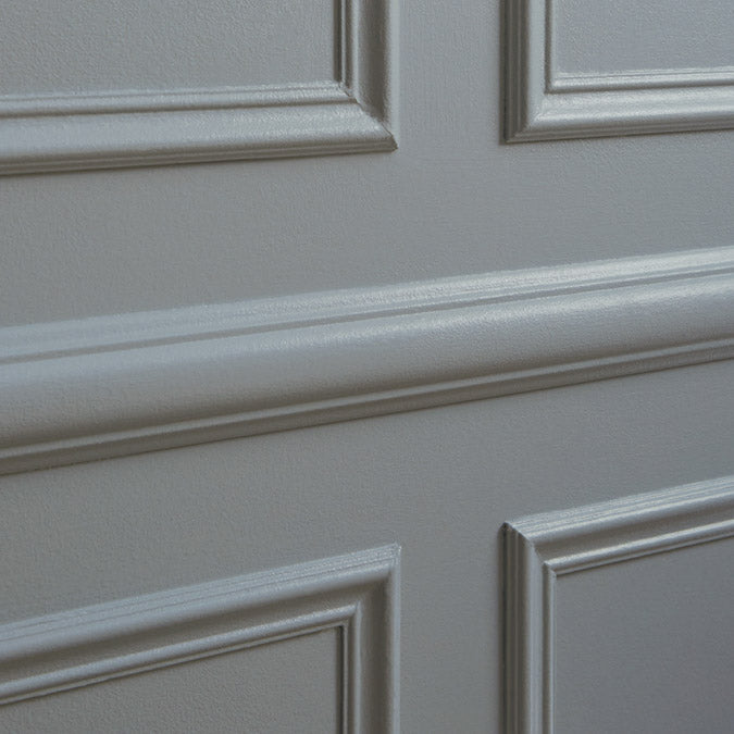
Set In Stone Gallons are available in both Wall Paint (Eggshell) and Trim Paint (Semi-gloss). Not sure yet? Sample it first with our Peel & Stick Swatches.
 Zero Voc*
 Superior Coverage
 Greenguard Gold Certified
 Washable & Scrubbable
 Ultra Low Odor
 Self Priming
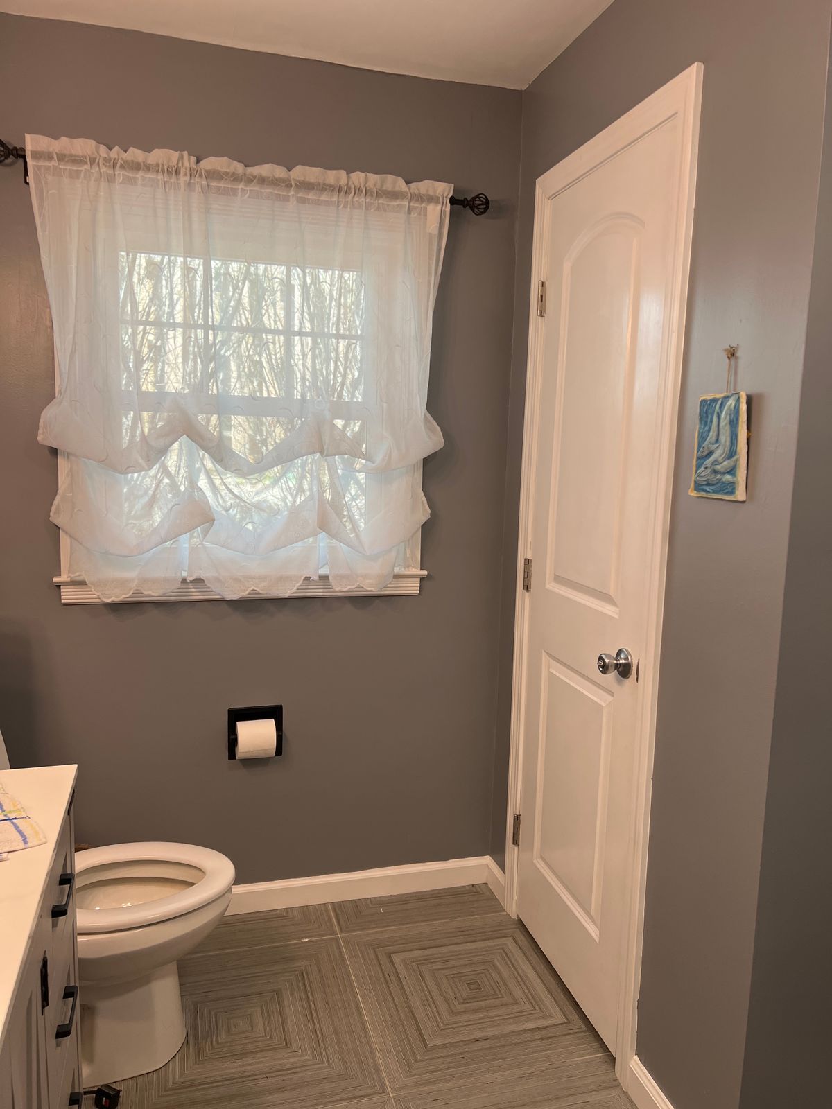
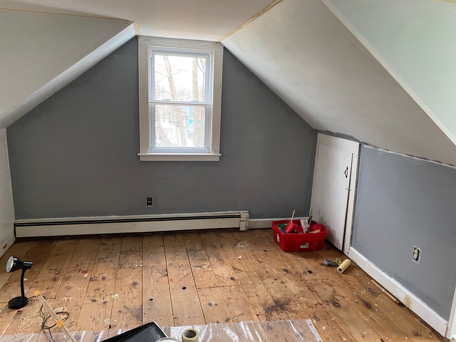
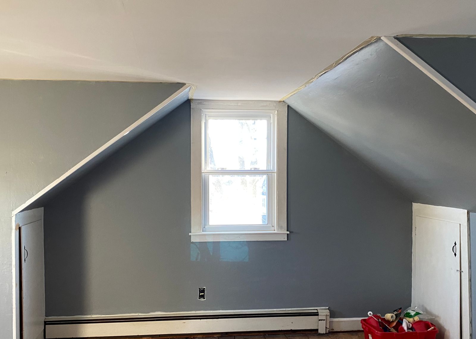
Set In Stone is a strong, medium-deep blue-gray with a cool undertone that gives it a modern, committed character. Clare's description says it directly: there is nothing wishy-washy about this color. The blue quality in the undertone keeps it from reading flat or neutral, placing it in the stone-and-slate category that works as well in a century-old home as in a modern one.
At an LRV of 33, Set In Stone holds the wall with real presence. The blue undertone comes forward clearly in natural daylight, and the depth reads richer in warm or evening light. One reviewer noted it dried darker than expected, a useful heads-up with a medium-deep cool gray, and coverage held up well at that depth across two extra-large bedrooms. The color also plays well against warm partners, with reviewers calling out yellows, golds, charcoal and oak floors as beautiful pairings.
The cool base pairs naturally with crisp whites on trim, natural wood and warm metals. Snow Day or Timeless on trim keeps the palette clean and gives the blue-gray room to read at its best. Set In Stone works in bedrooms, bathrooms, dining rooms, living rooms, home offices and on kitchen cabinets where a confident, sophisticated blue-gray is the goal. For something lighter and more neutral, Motor City sits at LRV 49 with only the faintest trace beyond pure gray. For more depth, Irony goes to dark charcoal at LRV 17.
Best for: Bedrooms, bathrooms, dining rooms, living rooms, offices, kitchen cabinets
Pairs best with: Snow Day (cool white trim), Timeless (off-white trim), Windy City (lighter greige complement), Good Jeans (denim-blue companion)
Color family: Gray (blue-gray/stone)
Undertone detail: Cool; the blue quality is clear and distinguishing. Reads modern and sophisticated rather than flat or neutral gray.
LRV interpretation: 33, a medium-deep value that holds the wall with real presence. Can read darker in person than on screen. Single-coat coverage documented, exceptional for this depth.
Lighting guidance: Natural daylight: clear, confident blue-gray with the cool undertone fully forward. Warm or low light: deepens and reads richer throughout.
Finish recommendation: Eggshell for walls; Semi-Gloss for trim, cabinets and doors for bold, dimensional contrast
Complementary Clare colors: Snow Day, Timeless, Windy City, Good Jeans, Headspace
Paint like a pro - and save $7

Our 7-Piece Paint Kit has all the tools you’ll need to prep and tackle your paint project like a pro.
The best base for brilliant color

Our fast-drying multi-surface primer—and the foundation for a flawless paint job.