

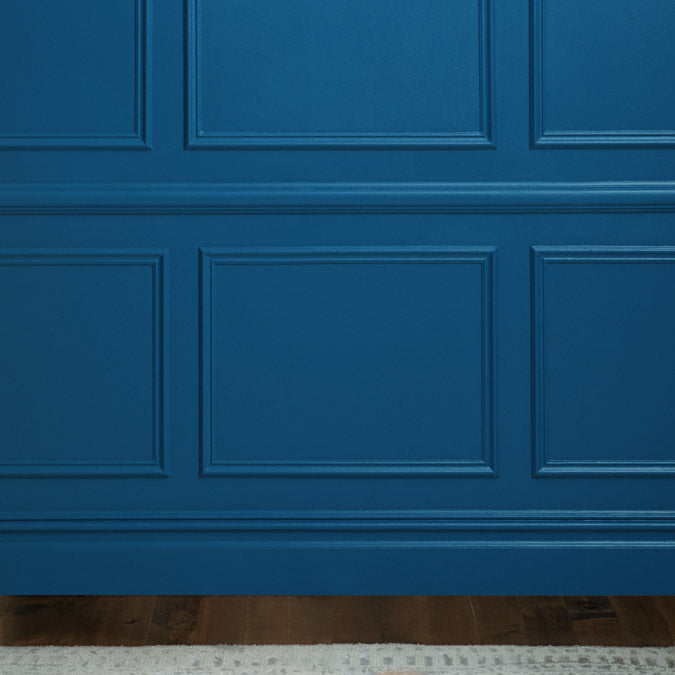
Hyperlink
- $77 Gallon
- $3 Swatch
Just like that classic blue born on the World Wide Web. Bright, bold, underlined. You can’t help but see where it leads.
Hyperlink Gallons are available in both Wall Paint (Eggshell) and Trim Paint (Semi-gloss). Not sure yet? Sample it first with our Peel & Stick Swatches.
 Zero Voc*
 Superior Coverage
 Greenguard Gold Certified
 Washable & Scrubbable
 Ultra Low Odor
 Self Priming
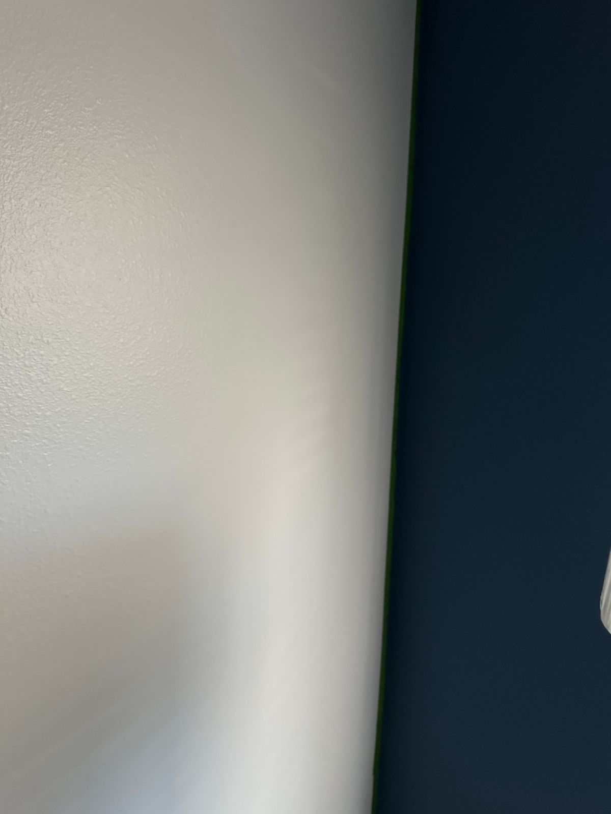
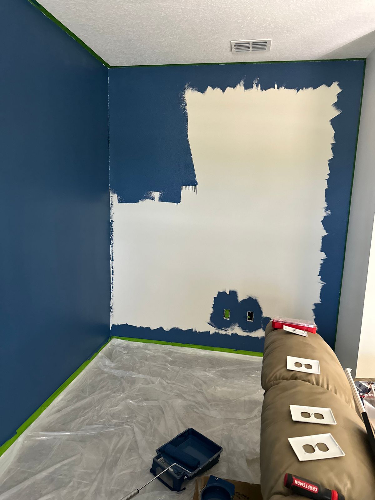
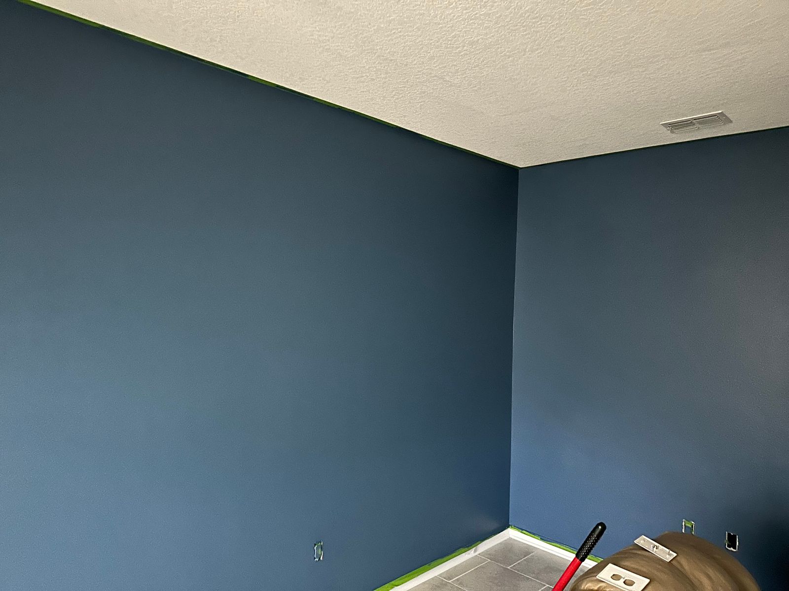
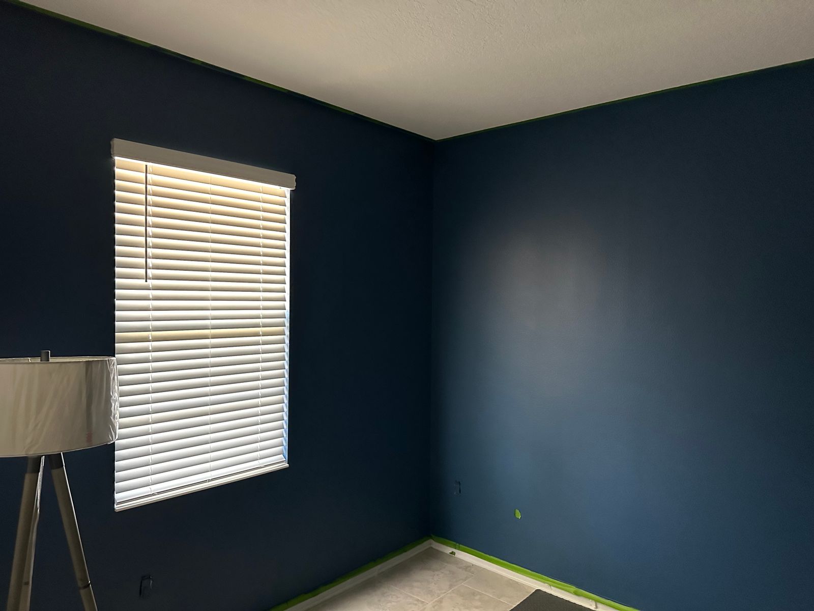
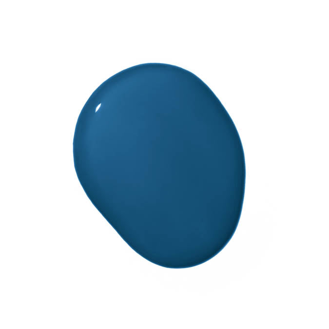
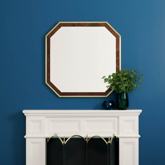
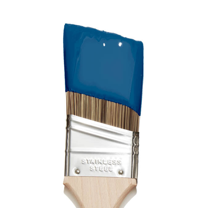
Hyperlink is a bold, saturated royal blue named after the classic link color of the early internet — that confident, unmissable blue that commanded attention and made you want to follow it. The cool undertone keeps it in pure blue territory, free of the navy drift or gray quality that softens most deep blues into something more neutral. The result is a blue that reads genuinely vivid even at depth.
At an LRV of 13, Hyperlink absorbs most light and creates a rich, immersive atmosphere, but unlike a midnight blue it stays clearly and saturatedly blue throughout the day. Reviewers describe it as sitting right between too dark and too bright, which is exactly what a bold royal blue does at this value. In natural light it reads crisp and vivid; under warm evening light it deepens without drifting toward navy or purple. One reviewer noted the color can look less saturated while wet and looks best once fully dry, which is worth knowing going in.
The cool base pairs most strikingly with crisp whites. Two separate reviewers independently confirmed Snow Day as the ideal companion: Hyperlink on feature walls and Snow Day on the remaining walls creates a room that reads bold and balanced at the same time. Fresh Kicks or Timeless on trim complete the palette. Hyperlink works in bedrooms, living rooms, home offices, kids' rooms, and accent walls where a vivid, confident blue is the goal. For something lighter, Nairobi Blue reads brighter and less saturated. For deeper and moodier, Goodnight Moon goes into midnight territory.
Best for: Bedrooms, living rooms, home offices, kids' rooms, accent walls
Pairs best with: Snow Day (ideal two-wall pairing), Fresh Kicks (bright white trim), Timeless (off-white trim)
Color family: Blue (royal)
Undertone detail: Cool; a pure, saturated royal blue with no navy drift, gray shift, or green undertone
LRV interpretation: 13, a deep, light-absorbing value that reads as rich, vivid royal blue. Noticeably brighter and more saturated than midnight or navy blues at similar depth
Lighting guidance: Natural daylight: vivid and crisp, blue reads fully. Warm or low light: deepens but stays clearly blue. Color reads better once fully dry than during application
Finish recommendation: Eggshell for walls; Semi-Gloss for trim and doors for clean, crisp contrast
Complementary Clare colors: Snow Day, Fresh Kicks, Timeless, Nairobi Blue, Good Jeans
Paint like a pro - and save $7

Our 7-Piece Paint Kit has all the tools you’ll need to prep and tackle your paint project like a pro.
The best base for brilliant color

Our fast-drying multi-surface primer—and the foundation for a flawless paint job.