4 Winter Color Palettes To Use Year Round
Cozy and warm is always in style.

The most beautiful part of winter is the stripping away of the non-essential. Everything feels stark and fresh, from the ice and snow to the steely skies. You can apply this same sensibility to your interiors, drawing attention to cooler colors with dimension and furniture or accessories that offer lots of texture and visual interest. The best part of embracing a winter color palette is its versatility; these tones work just as well in your home in the summer too.
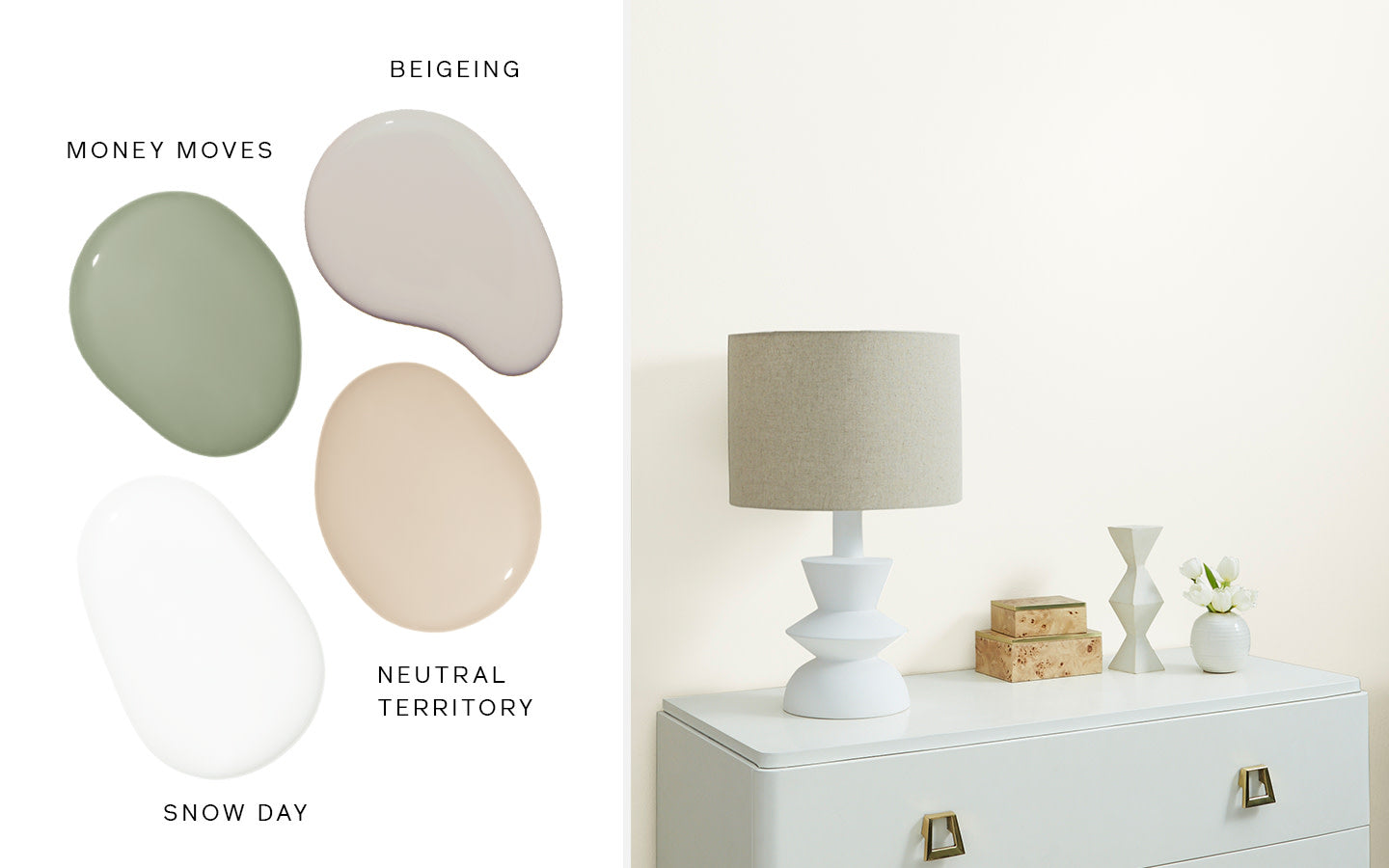
Snow Day

Meet Clare’s coolest white! An excellent option for a bathroom or kitchen, this color feels as clean as a fresh snowfall. “It has just enough of a touch of warmth to liven it up and keep it from feeling sterile,” says Gibbons. “Shades of white work anywhere but I especially love a cooler white for neutralizing a south facing room that tends to get more golden natural light.” It looks especially beautiful when it’s accented with rich woods and varying shades of gray. Try it in our trim paint finish too!
Pair it with: Penthouse / Seize the Gray / Dirty Martini / Current Mood
Frozen

Go ahead and call it a crowd pleaser! More than 2,000 customers and fans voted this pale blue into existence as Clare’s newest color. A confident classic that practically begs to be included in a bedroom or bathroom, it feels as invigorating as a frost-filled morning. “Color can impact the mood and energy of a room,” says Gibbons. “Blues work so well in these spaces because they always feel tranquil and relaxing—exactly how you want to feel while you’re getting ready for bed or soaking in your tub.”
Pair it with: Chill /Grayish / Coffee Date / Dirty Chai / Golden Hour
Chill

If you’re worried about gray feeling too basic, this soft color hits more than one note. Its slightly green undertones feel airy and calming but still multidimensional enough to last. Undertones in a color are what make a paint feel more dynamic; swapping in and out different colored accessories can give this hue an entirely new look and feel. “I used this in my own bathroom paired with bright white subway tile and it offers the perfect hint of subtle color on the walls,” says Gibbons. “You can pair it with pops of punchy color to bring a kid’s room or a nursery to life or to bring zen vibes to your living room or bedroom.”
Pair it with: Frozen / On Point / No Filter / Pink Sky / Good Jeans
Timeless

There’s a reason this color is a bestseller. You can use it to create a versatile foundation in your home or to warm up a more formal living or dining room. It plays nicely with a myriad of other colors and reflects the light—both natural and artificial—beautifully. Which really helps warm up a home in colder winter months. “When designing a room I like to take cues from fashion, I love a classic, winter-white look. Sometimes winter-white is a warmer, almost ivory-white that’s soft, nuanced and relaxed,” says Gibbons. “I think of a rich winter-white cashmere sweater paired with a more relaxed, ripped denim. Timeless is just as beautiful and classic.”
Pair it with: Snow Day / Beigeing / Neutral Territory / Money Moves
Tags:


