

Headspace
- $77 Gallon
- $3 Swatch
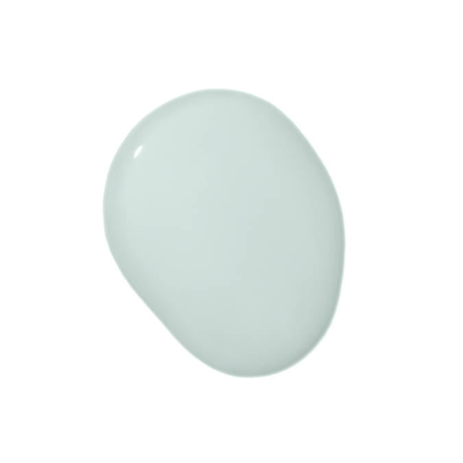
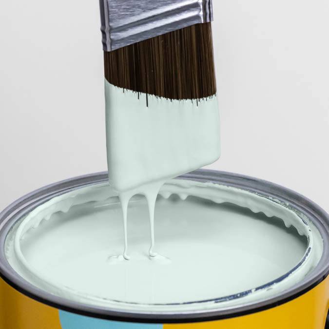
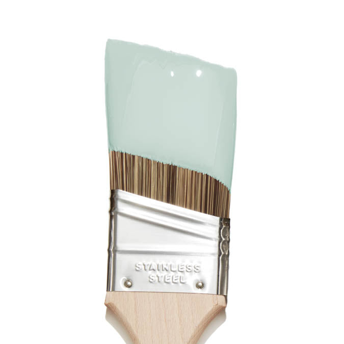
A universal favorite, this soft and airy blue-green hue brings a sense of calm to any space.
Headspace Gallons are available in both Wall Paint (Eggshell) and Trim Paint (Semi-gloss). Not sure yet? Sample it first with our Peel & Stick Swatches.
 Zero Voc*
 Superior Coverage
 Greenguard Gold Certified
 Washable & Scrubbable
 Ultra Low Odor
 Self Priming
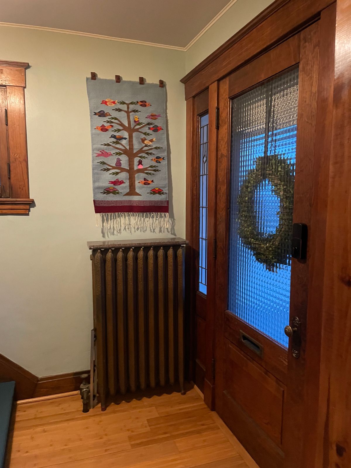
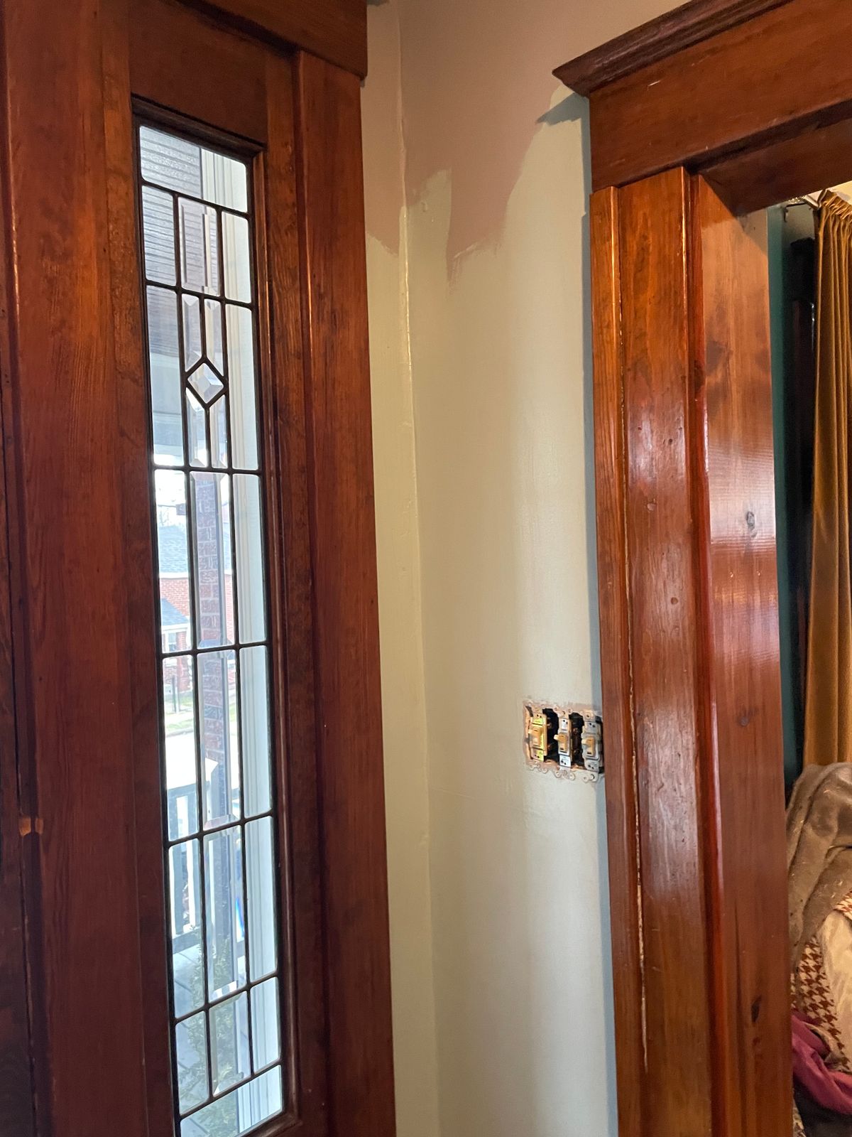
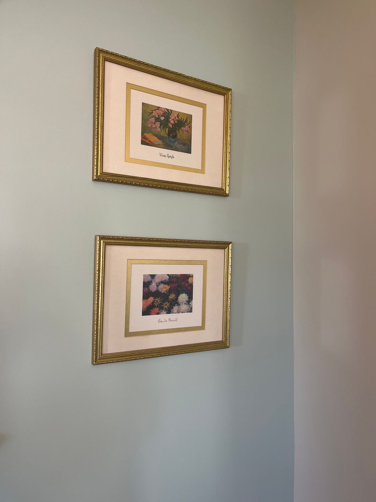
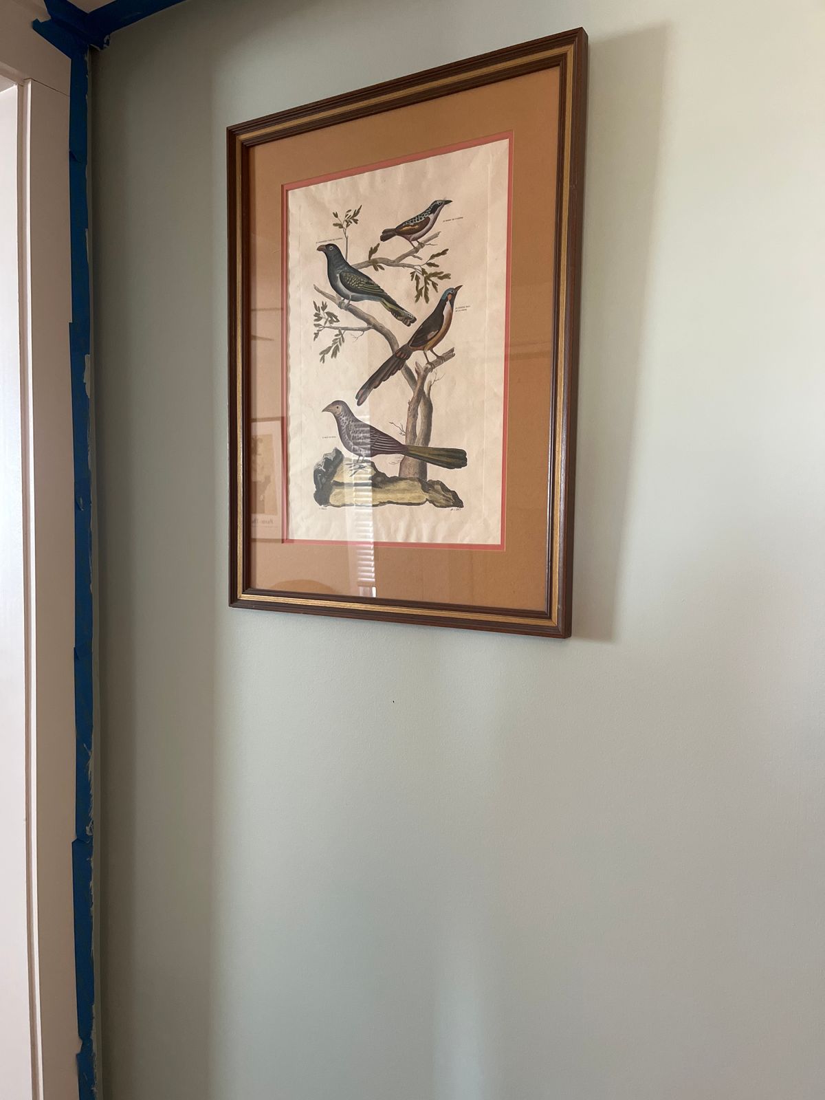
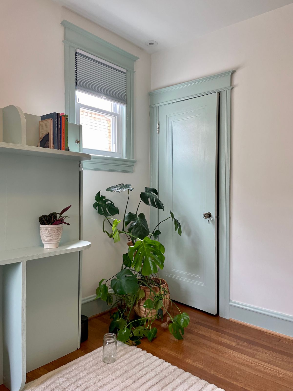
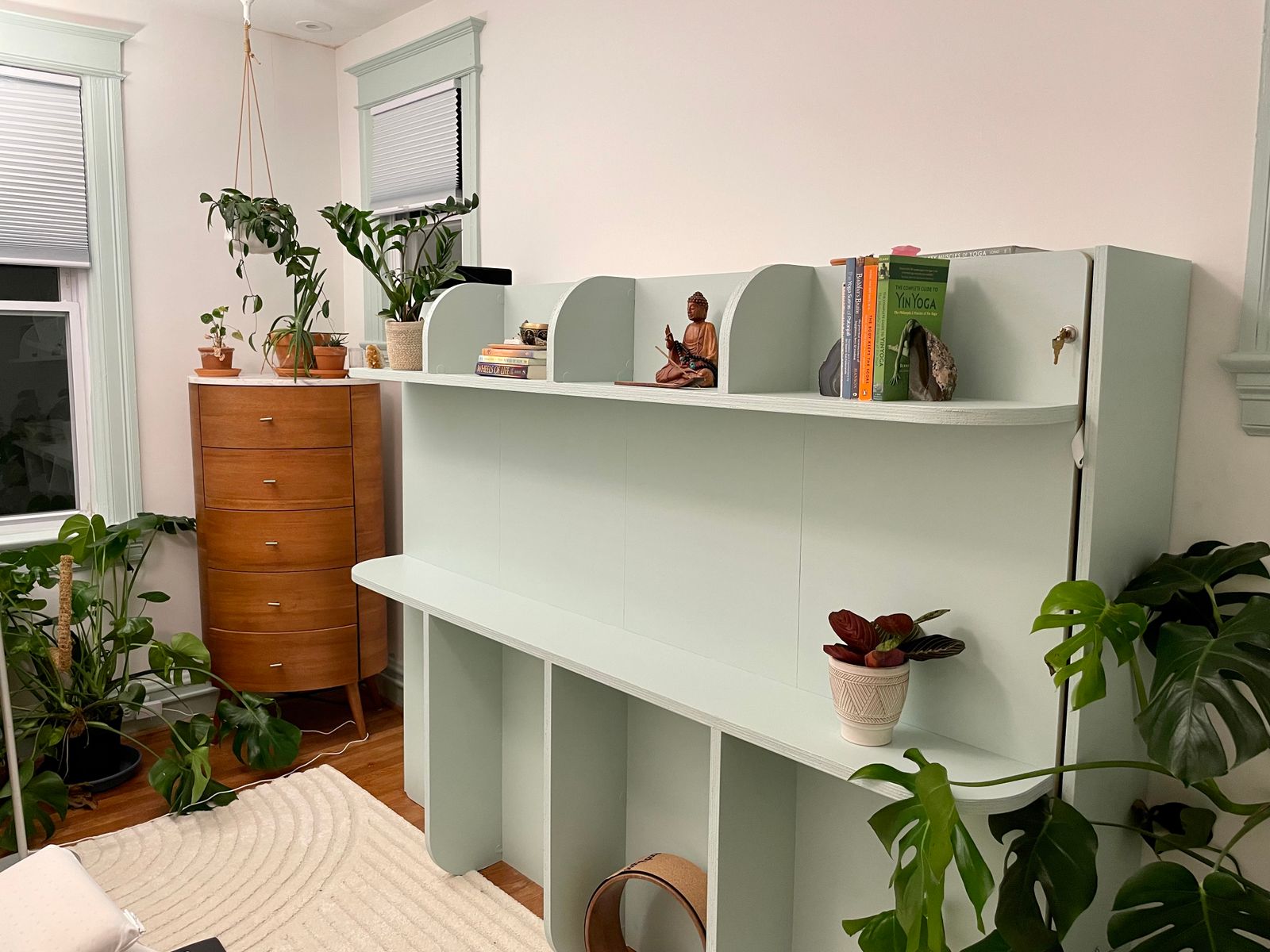
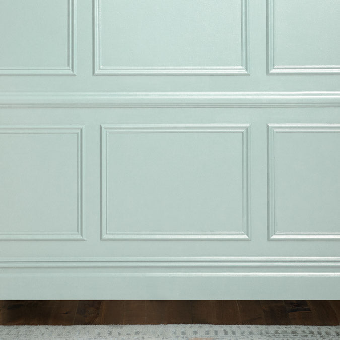
Headspace is a soft, airy blue-green that sits at the serene midpoint between blue and green, making it one of those rare colors that reads differently depending on the room and the light. Some call it teal. Some call it spa. Some call it mint. The color shifts across those readings in a way that works for rather than against it, delivering a calm, fresh quality that one reviewer captured precisely: joyful without being disruptive.
At an LRV of 60, Headspace reflects a generous amount of light while holding enough depth to read as a real, present color. The cool undertone gives it a characteristic freshness, keeping the blue-green quality clean rather than muted or gray. One reviewer started with it in a dining room, loved the result, and brought it to the foyer and staircase six months later. Another covered a heavy previous color with a single coat over primer and found the coverage exceeded expectations.
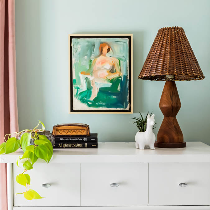
The cool base pairs naturally with crisp whites on trim and ceilings, warm wood, and simple natural metals for a balanced, spa-like palette. Snow Day on the ceiling extends the airy quality overhead. Headspace works in bedrooms, bathrooms, dining rooms, living rooms, foyers, and stairways where a fresh, calming color is the goal. For more definitively blue, Frozen or Flow State pulls away from the green. For a deeper, more saturated blue-green, Make Waves steps up the richness.
Best for: Bedrooms, bathrooms, dining rooms, living rooms, foyers and entryways, stairways
Pairs best with: Snow Day (cool white ceiling), Timeless (off-white trim), Frozen (lighter blue companion), Make Waves (deeper blue-green complement)
Color family: Blue-green (teal/spa)
Undertone detail: Cool; keeps the blue-green clean and fresh rather than muted or gray. Reads between teal and mint depending on room lighting and exposure
LRV interpretation: 60, a mid-to-high value that keeps rooms bright and airy while delivering real color presence
Lighting guidance: Natural daylight: crisp blue-green, teal quality comes forward. Warm or low light: green comes forward more and the color reads mintier
Finish recommendation: Eggshell for walls; Semi-Gloss for trim and doors for clean, spa-like contrast
Complementary Clare colors: Snow Day, Timeless, Frozen, Flow State, Make Waves
Paint like a pro - and save $7

Our 7-Piece Paint Kit has all the tools you’ll need to prep and tackle your paint project like a pro.
The best base for brilliant color

Our fast-drying multi-surface primer—and the foundation for a flawless paint job.