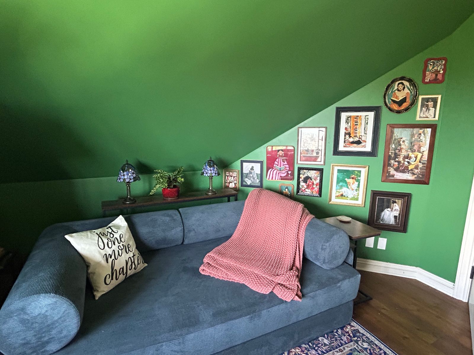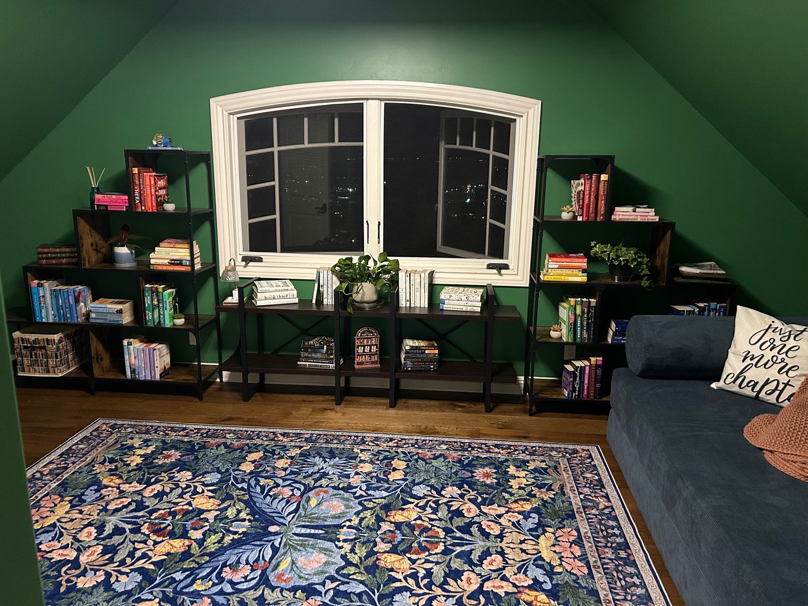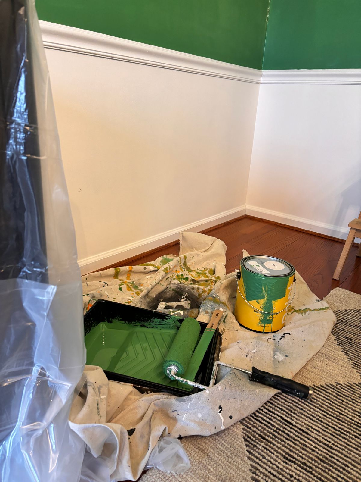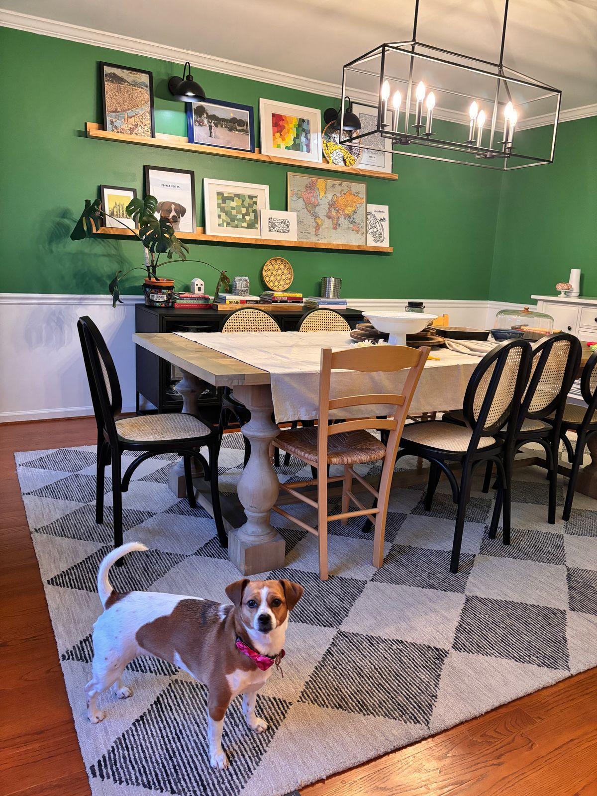


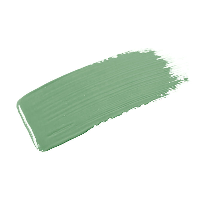
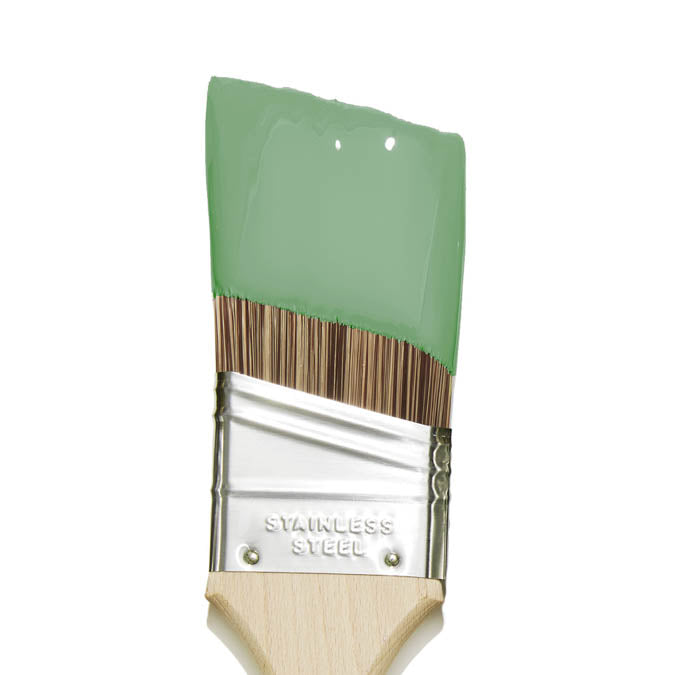
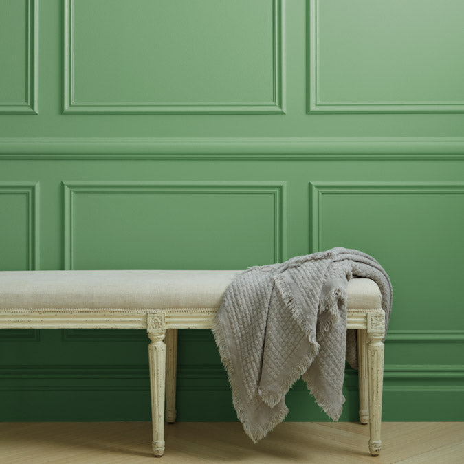
Matcha Latte
- $77 Gallon
- $3 Swatch
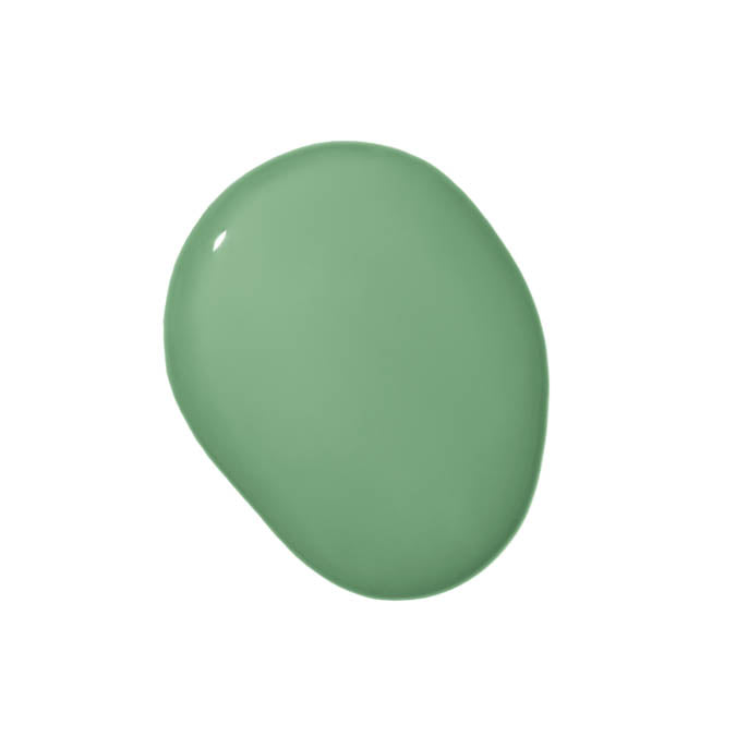
A bold, rich green that’s energizing like its namesake.
Matcha Latte Gallons are available in both Wall Paint (Eggshell) and Trim Paint (Semi-gloss). Not sure yet? Sample it first with our Peel & Stick Swatches.
 Zero Voc*
 Superior Coverage
 Greenguard Gold Certified
 Washable & Scrubbable
 Ultra Low Odor
 Self Priming
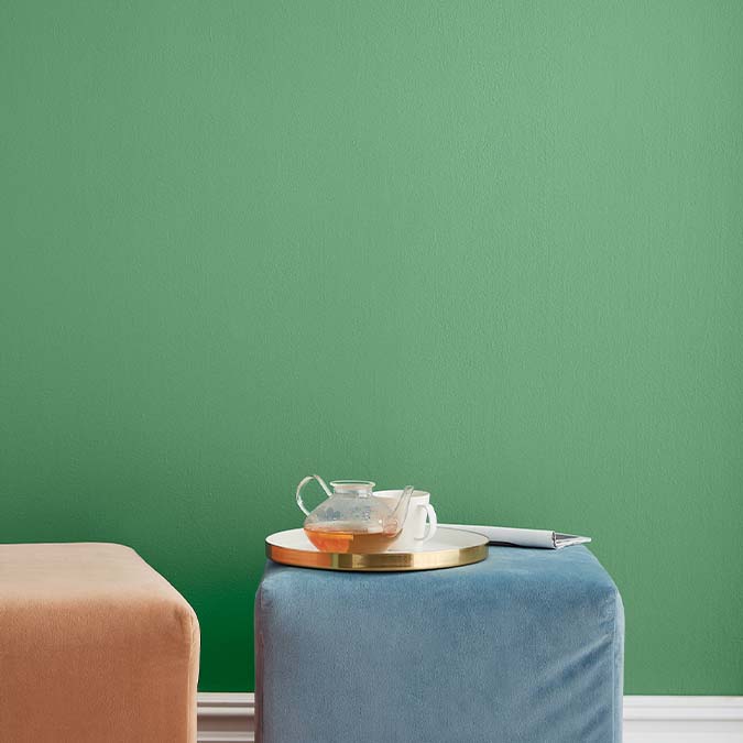
Matcha Latte is a bold, deeply saturated green with a cool undertone that keeps it crisp and vivid rather than warm or earthy. This is the kind of green that reviewers call schoolhouse green or Kelly green: a clear, confident, energizing color that reads lively and present without tipping into the olive or sage direction. The cool undertone holds the green quality pure and saturated throughout.
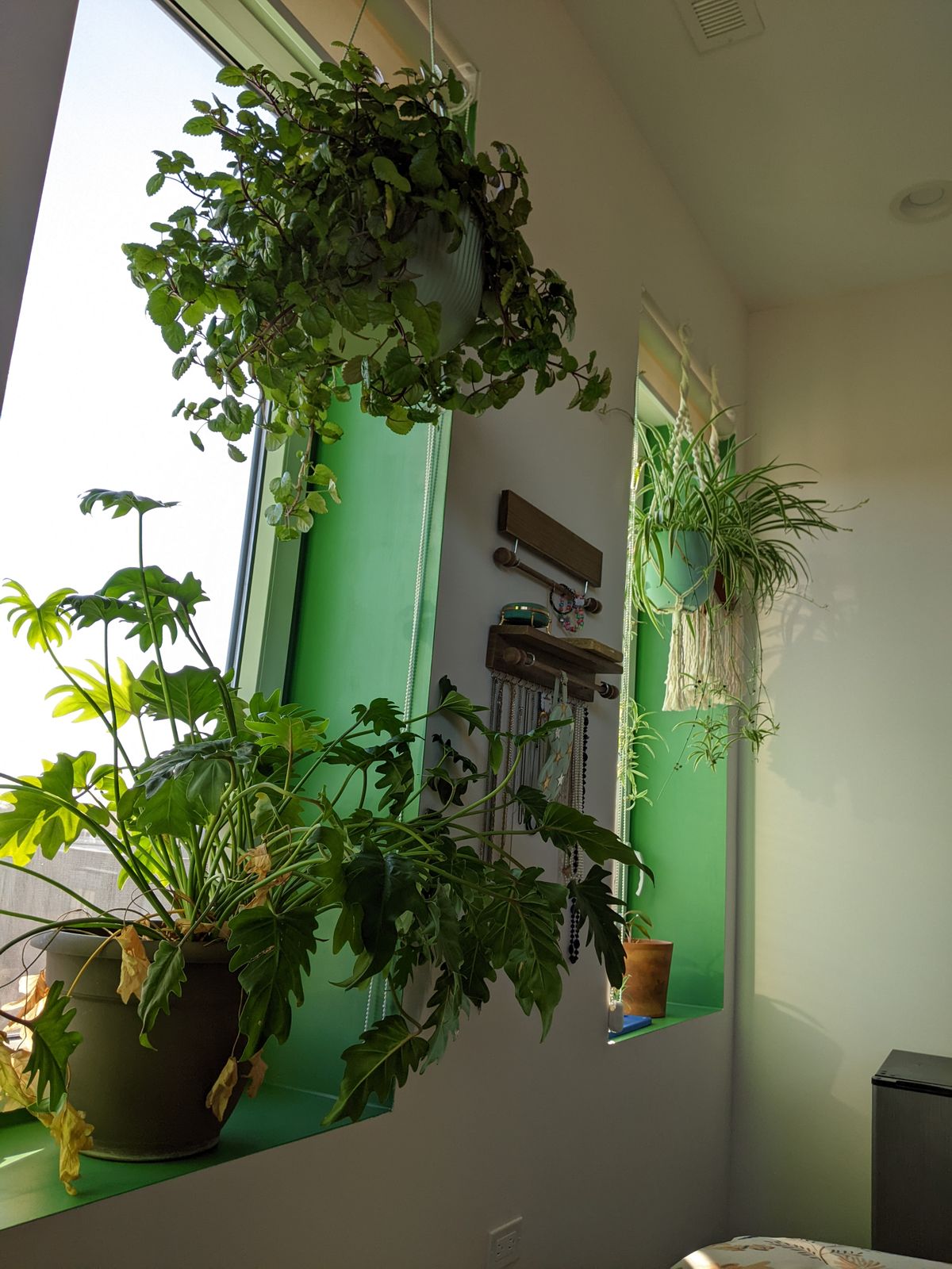
At an LRV of 24, Matcha Latte absorbs significant light and creates a rich, immersive atmosphere. That depth rewards the color, giving it the wonderful depth and richness reviewers note even in smaller applications like cabinet doors and windowsills. In well-lit rooms it reads as a vibrant, full-bodied green; in lower light it deepens and settles into something more sophisticated. For painting over dark surfaces or when using it in trim applications, planning for an extra coat is advisable at this depth.
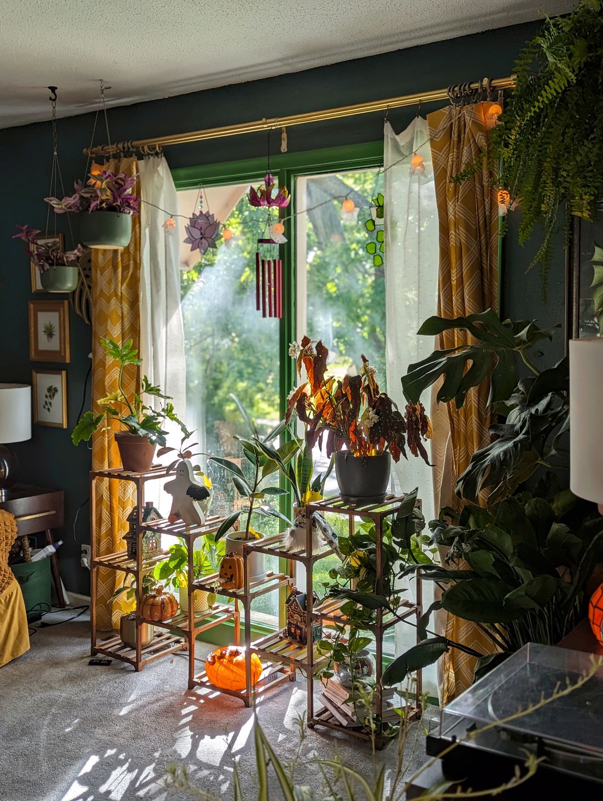
The cool base pairs beautifully with warm whites and creamy neutrals on trim, natural wood, and warm metals. Neutral Territory on upper cabinets keeps the palette balanced when Matcha Latte goes on lowers. Timeless or Whipped on trim reads clean and cohesive alongside it. Matcha Latte works in kitchens (walls and cabinetry), dining rooms, living rooms, bedrooms, and accent millwork where a bold, saturated green is the goal. For something deeper and moodier, Current Mood goes richer and warmer. For a lighter, fresher option, Avocado Toast reads more medium at LRV 39.
Best for: Kitchens (walls and cabinetry), dining rooms, living rooms, bedrooms, window trim and railings, accent walls
Pairs best with: Neutral Territory (warm beige for cabinet uppers), Whipped (warm white trim), Timeless (off-white trim), Avocado Toast (lighter green companion)
Color family: Green (rich/bold/kelly)
Undertone detail: Cool; keeps the green crisp, vivid, and saturated rather than warm, earthy, or olive
LRV interpretation: 24, a deep, light-absorbing value that reads as rich, vivid green. Plan for an extra coat when painting over dark surfaces or in trim applications
Lighting guidance: Natural daylight: crisp, vivid, and energizing. Warm or low light: deepens and reads richer and more sophisticated
Finish recommendation: Eggshell for walls; Semi-Gloss for trim, doors, cabinets, and millwork for durable, dimensional contrast
Complementary Clare colors: Neutral Territory, Whipped, Timeless, Avocado Toast, Greenish
Paint like a pro - and save $7

Our 7-Piece Paint Kit has all the tools you’ll need to prep and tackle your paint project like a pro.
The best base for brilliant color

Our fast-drying multi-surface primer—and the foundation for a flawless paint job.