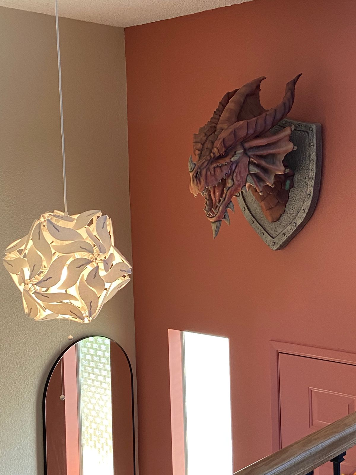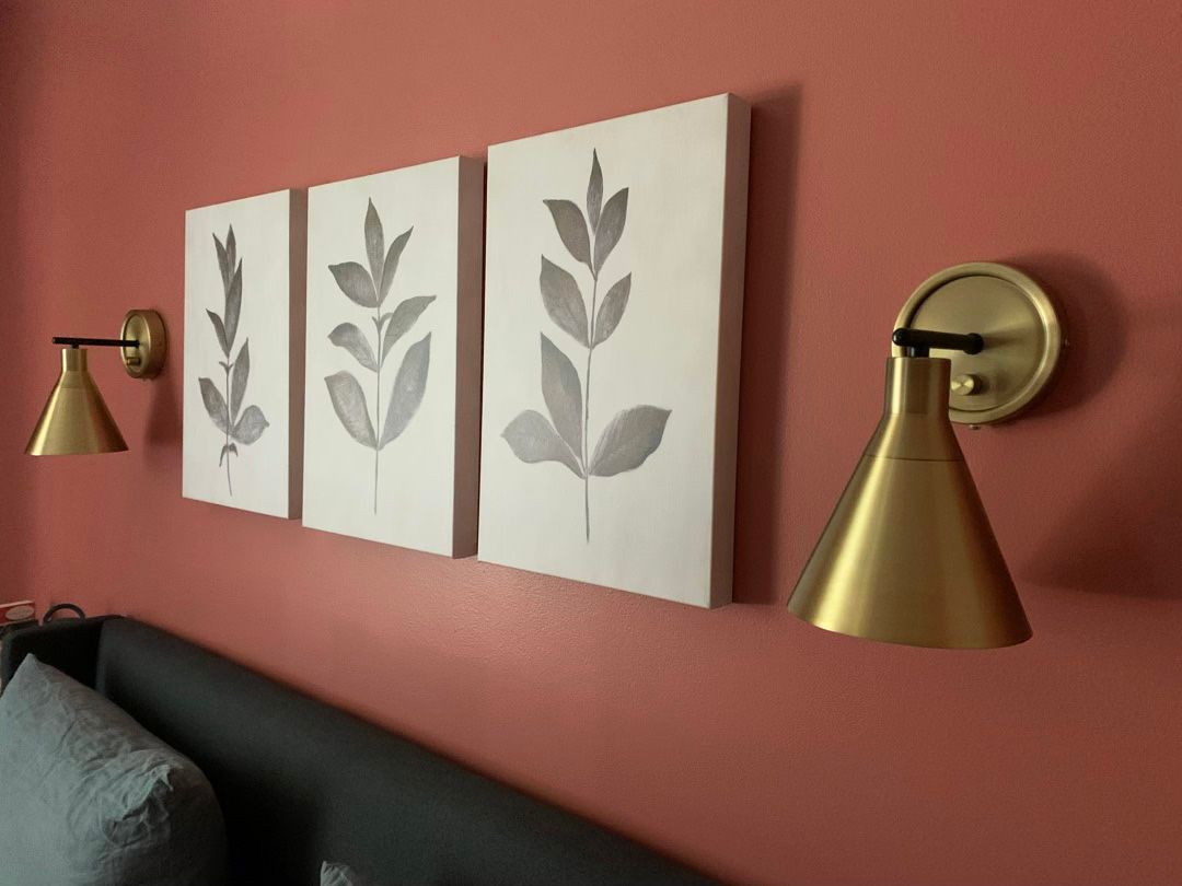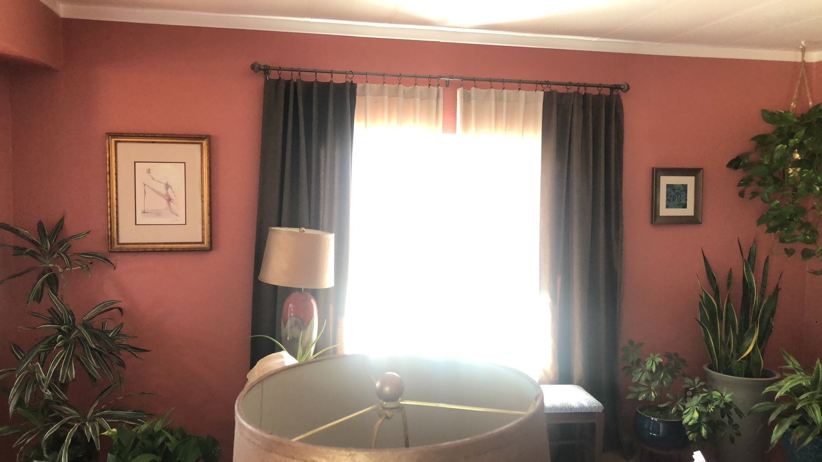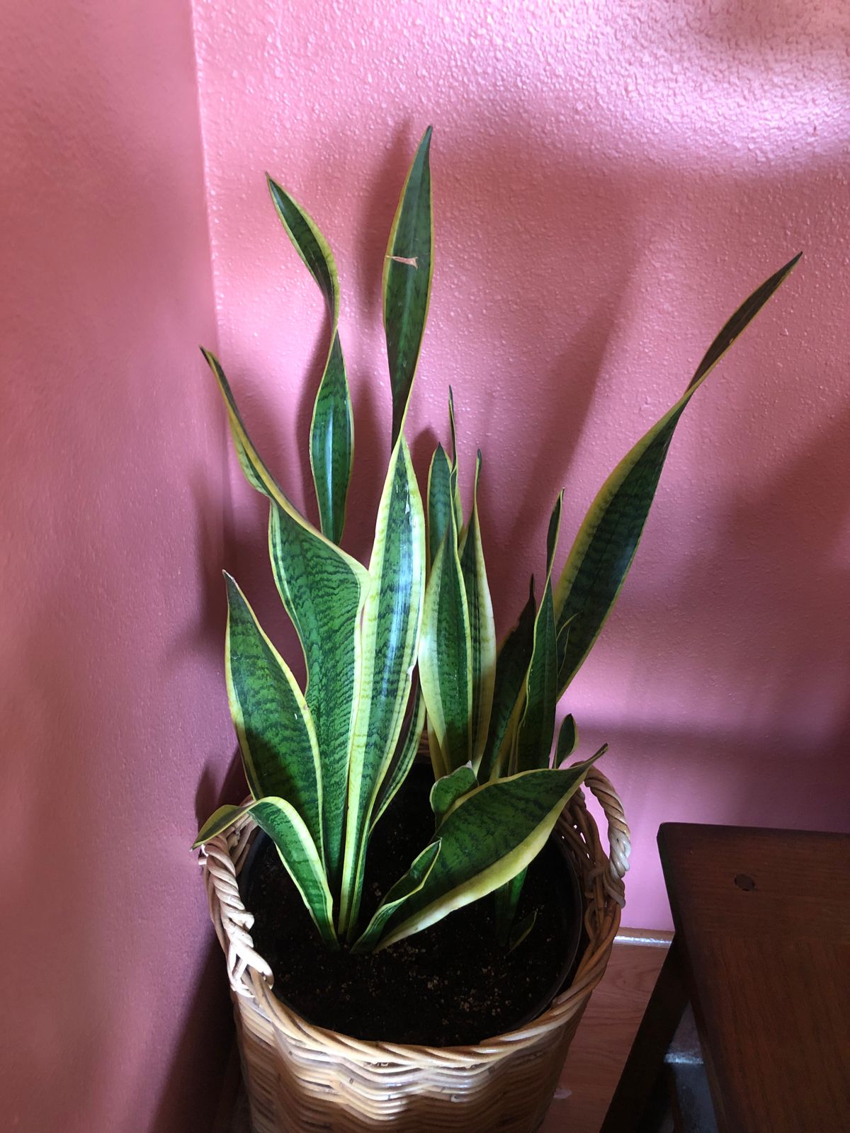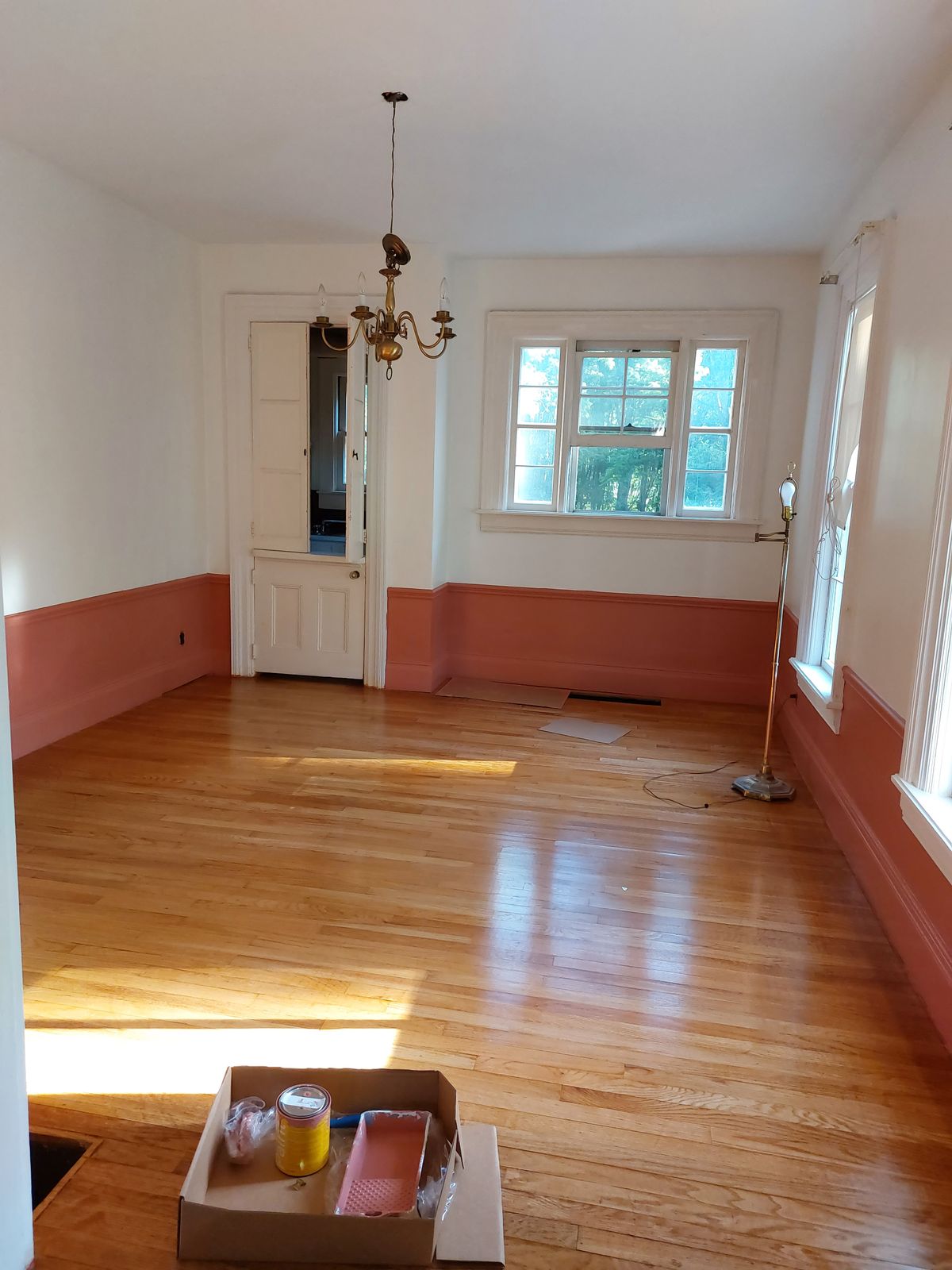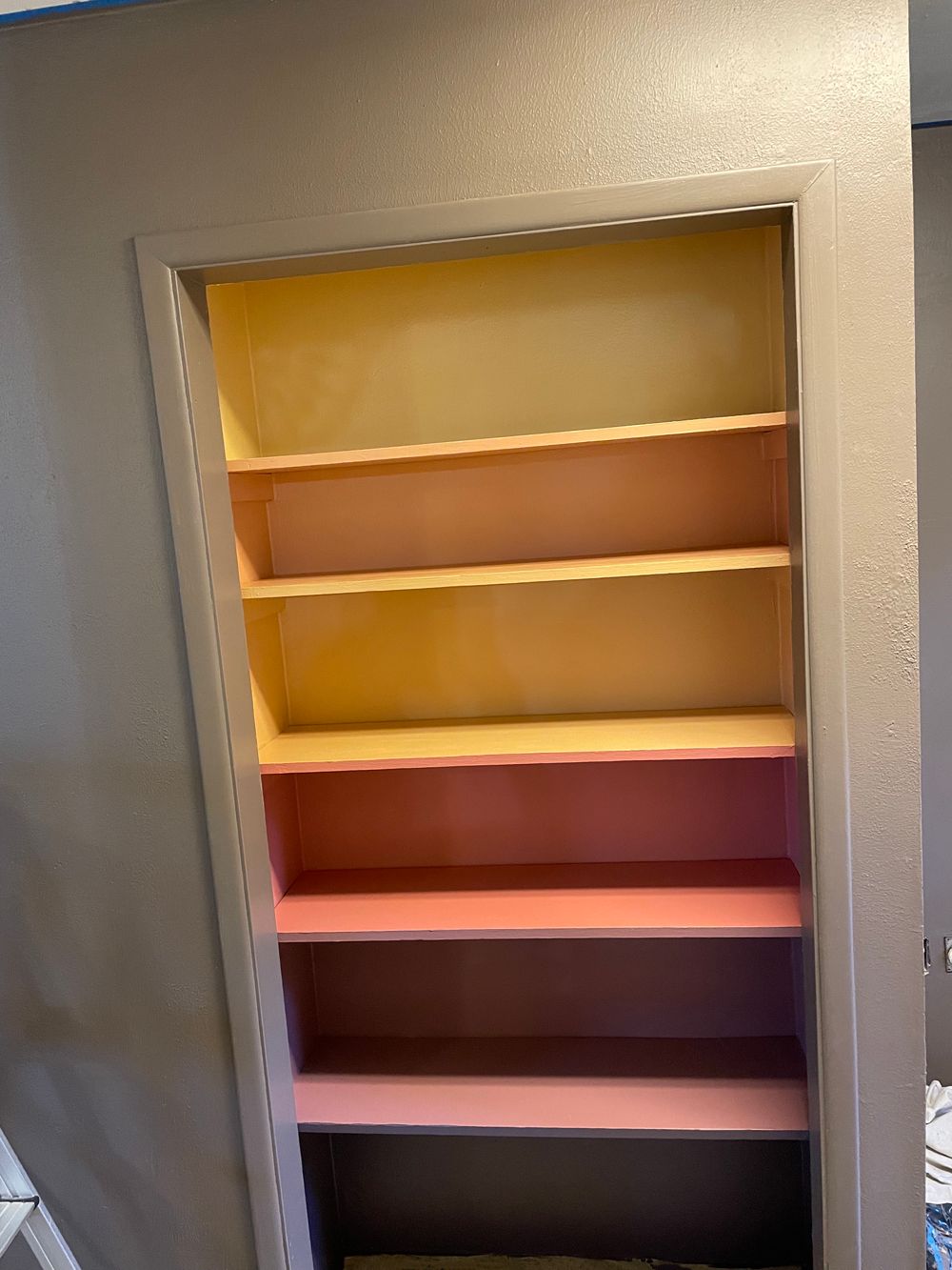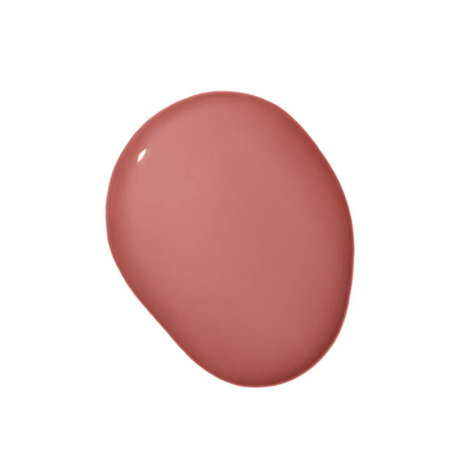
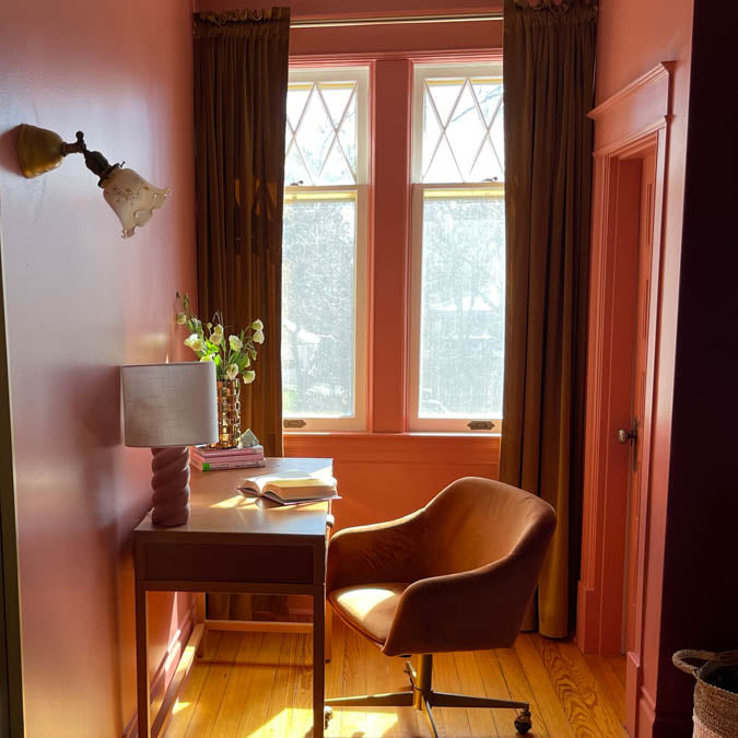
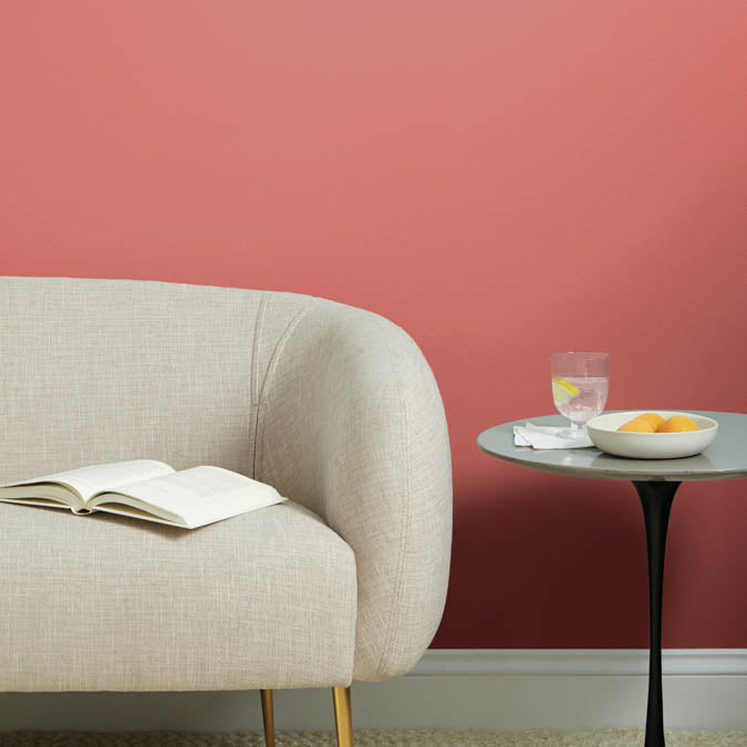
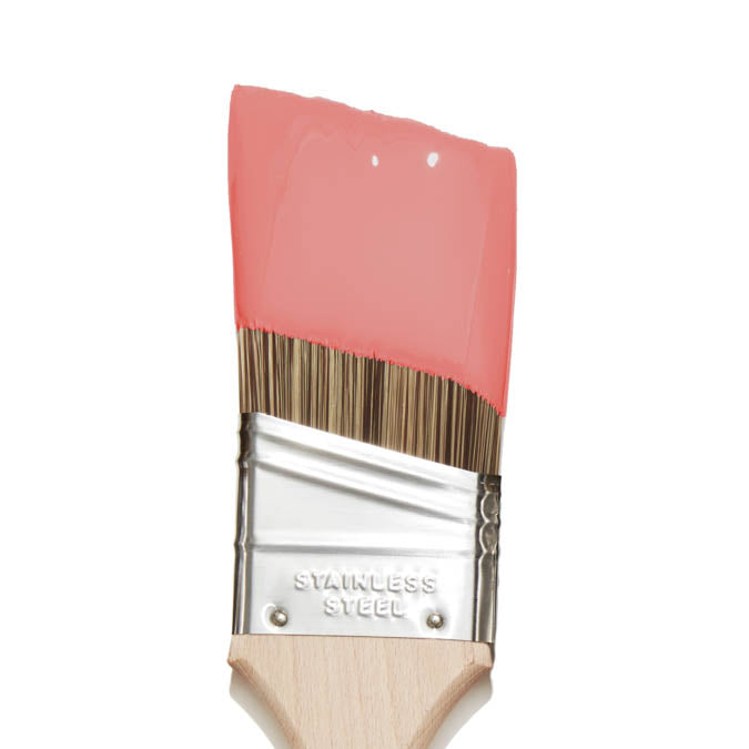
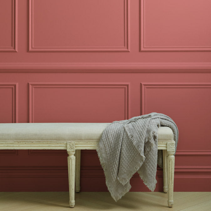
Pink Sky
- $77 Gallon
- $3 Swatch
Rated 5.0 out of 5
That stunning coral-y pink hue that fills the sky as the sun dips below the horizon. We think it’s pretty perfect.
Pink Sky Gallons are available in both Wall Paint (Eggshell) and Trim Paint (Semi-gloss). Not sure yet? Sample it first with our Peel & Stick Swatches.
A better paint from start to finish
![]() Zero Voc*
Zero Voc*
![]() Superior Coverage
Superior Coverage
![]() Greenguard Gold Certified
Greenguard Gold Certified
![]() Washable & Scrubbable
Washable & Scrubbable
![]() Ultra Low Odor
Ultra Low Odor
![]() Self Priming
Self Priming
Our zero VOC, GREENGUARD Gold certified Wall Paint and Trim Paint is 100% acrylic, self-priming, applies easily, covers in fewer coats and dries to a durable, mildew-resistant finish that washes with ease.
LRV: 27
Undertone: Warm
Undertone: Warm
Paint like a pro - and save $7

Our 7-Piece Paint Kit has all the tools you’ll need to prep and tackle your paint project like a pro.
The best base for brilliant color

Our fast-drying multi-surface primer—and the foundation for a flawless paint job.