
How to Choose the Best Color Combinations For Your Home
Palette play 101.

Choosing the best color combinations for your home should be fun, not stressful. While our peel and stick paint swatches ensure you end up with the right shade, there are a few other tips for deciding on the best color combinations for your home. Color is so important—it has the power to change the mood in the room, it can be restful and cozy, or loud and energizing. Ahead, we're sharing some really good color combinations to help you figure out the best color combinations to use in your space:
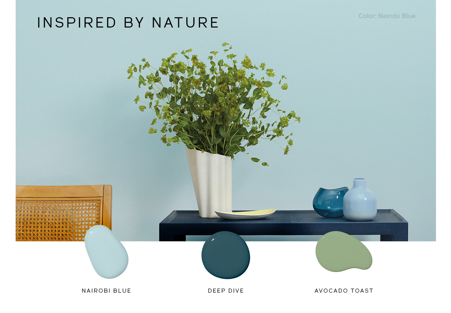
Colors L-R: Nairobi Blue / Deep Dive / Avocado Toast
Good Color Combinations are Everywhere
Color is everywhere, so you’ve already chosen or gravitated to colors and patterns that you love—just maybe not in the way you think. Your clothes, favorite pieces of artwork, or even nature can help show you what paint schemes look good together. Find a piece you love that’s full of color, or even full of different neutral hues, and then pull colors you love from it. That way you already know they look amazing together and you can feel more comfortable mimicking those combinations in your home.

Colors L-R: Neutral Territory / Beigeing / Flatiron
When in Doubt, Opt for Monochromatic Paint Schemes
If you’re feeling really unsure about what room color schemes you like, opt for a monochromatic palette which is virtually foolproof. A scheme featuring different variations of the same color always feels sophisticated and pulled together. Plus, monochromatic paint schemes are guaranteed to coordinate and ensures that transitions between rooms areé seamless and cohesive.

Colors L-R: Rose Season / Current Mood / Wing It
Look to Opposites for Color Palette Ideas
Remember the color wheel? Remember how the color directly across on the color wheel was called a complementary color? These opposite color tones play off one another so nicely, but don’t take these primary color pairings too literally. Variations of these basic hues tend to look better together, so a mossy green paired with purple accents or blues with a red or coral color. The opposites help balance each other out.
Keep Color Temperatures Consistent
Interior color schemes, like individual colors have temperatures. Colors such as yellow, red or pink are considered warm as they are reminiscent of warm things like sunlight or fire, and tend to make a space feel cozy. Colors such as blue or green have cool undertones and are reminiscent of cool things such as the water or a breezy sky and tend to make a space feel airy and fresh. Grouping colors that are the same temperature together always creates a nice balance. So greens and blues look beautiful paired together, same thing with warm colors like a rich yellow with a warm brown.
Tags:
We make paint shopping simple with curated colors, zero VOC paint and everything you need to create a home you love, delivered.


