In Joy Cho’s L.A. House, Every Room Packs a Colorful Punch
But she embraced timeless neutrals too.

Between her fun DIY projects and eye-catching collaborations, Joy Cho is known for her bold and vibrant style. But, when it came to picking paint colors for her house in Los Angeles, the multi-hyphenate creative wanted to give her signature taste a refined edge.
“I love color and pattern, but I was also looking at what makes sense for this stage of life and in a sophisticated way where it doesn't feel too novelty,” she shares. Cho’s newly-constructed home—which she shares with her husband, Bob and their daughters, Ruby and Coco—is a labor of love seven years in the making: from the day the couple bought a plot of land in the hills in 2014, to when they finally moved in earlier in 2020.

Every detail was carefully thought-out over the nearly decade-long project: “It’s a modern home but, because there’s a lot of woods and warmth, we wanted to create a space that wasn’t too cold like some contemporary houses can be,” Cho explains. She enlisted interior designer Cleo Murnane of Project M Plus to help marry Cho’s statement-making and sophisticated sides.
A bevy of Clare shades, ranging from the always-versatile Classic to the greenish blue tones of Make Waves, were instrumental in setting the tone: “We used color in ways that are meant to be unexpected, but also feel very age-appropriate in the more adult spaces.” With a mix of wallpaper, tile, and curated furniture (and the right paint colors for the house), Cho’s space strikes just the right balance between timeless, vibrant, and curated.
Look Beyond Fresh White Walls

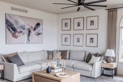
Since Cho’s home features ample common space for her family to enjoy, she wanted to splash her walls with a color that could seamlessly transition from one area to the other. White paint might’ve seemed the obvious choice, but finding the right tone for the space was a tall order.
“There is power in white paint,” Cho shares. “Is it warm? Is it cool? Does it have more browns in it? Or, more blue undertones?” The right shade would have to enhance, not compete with, Cho’s emerald sofa and statement art. “Because everything is so new, I didn’t want a bright white on everything,” she explains.
Ultimately, She coated the majority of her common spaces in Classic, the lightest greige that takes on the life of an airy neutral. “Classic has a warmth to it, it’s not a crisp white that reflects light off the wall and has everything looking so stark.”
Go For the Bold


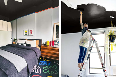
Though the home’s common spaces boast a more neutral color palette, Cho wanted to bring her vibrant personality into more personal quarters. “Imagine each room has a different member of the family,” she shares. “They all have their own point of view, but still have something in common.” The primary bedroom, for example, features a subtle neutral wallpaper and Timeless—a creamy off-white—on the ceiling, while the ensuite bath boasts a feature walls of turquoise Zellige tile surrounded walls painted in Make Waves, a deep greenish blue, creating an immediate sense of zen.

Cho’s guest room, on the other hand, is swathed in Deep Dive. “We wanted it to feel special and cozy,” she shares. “The deep color on all the walls has a lot of impact and feels sophisticated. It’s not a color you’d expect, but we get so many comments whenever we have guests over.” To bring those cozy vibes front and center, Cho stuck with a strictly blue palette and layered on tonal textures through window shades, a velvet headboard, and throw pillows.
Experiment With Pattern


In some rooms, paint was the star of the show while in others, it served as the perfect complement to striking wallpapers and patterns. In the guest bathroom for example, Cho juxtaposed a marbled wallpaper by Rebecca Atwood with Chill, a barely-there gray with green undertones on the ceiling. “The wallpaper was probably the first point and then came the accessories,” explains Cho. “The paint was the final touch so we always made sure it matched the warmth or coolness of the other elements.”
The Tiled Treatment

Wallpaper was just one way to bring a room to another design dimension. Cho deftly paired punchy paint colors for the house with tile that offers a hint of texture. One of her favorite examples? Her daughters’ bathroom, which features a wall of glass tiles and where a tone-on-tone scheme feels all-encompassing.
“There are shades of pink in there,” she says. “There are also texture changes from shiny and glossy to matte and smooth.” Cho really wanted to make the pink hue pop without losing an ounce of sophistication. So, she opted for Wing It, an ultra-light pink that acts as a neutral. Rounding out the space with a modern shower curtain and terrazzo flooring, this bathroom gives childhood wonder a chic edge.

“We didn’t want it to be too sweet,” Cho shares. “We wanted it to feel modern and glamorous.” It’s a balance she ultimately managed to strike in more rooms than one.
Next up: This Venice Beach bungalow is a lesson in cool coastal style.
Tags:
We make paint shopping simple with curated colors, zero VOC paint and everything you need to create a home you love, delivered.