Love Neutrals? Then You’ll Love these Interior Designer-Approved Paint Colors
From warm, rich beiges to cool, modern grays.

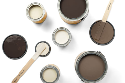
We tapped Orlando and a few other top interior designers to share their favorite go-to neutral paint colors, from barely-there grays to the warmest of beiges to their favorite unexpected picks.
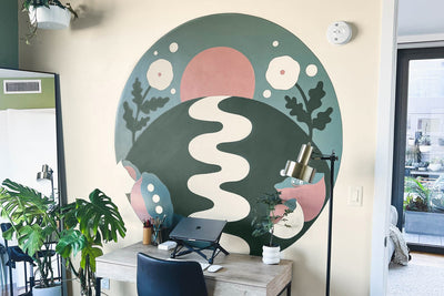
The Best Pink Neutral: Wing It

The Best Light Beige Neutral: No Filter

No Filter is beloved for the beautiful balance it possesses. Orlando, who used the color in his California cabin, says it best: “I love No Filter because it's a great beige that is warm without being orange, and neutral without being gray. It makes a great color for common spaces and any space that gets decent light.”

Designer and creative Shelby Girard employed the shade in her Connecticut home’s kitchen reno—and to beautiful results. “I tested the sample of No Filter in a few locations in the kitchen and was quickly sold—it’s the perfect balance between warm and cool and doesn't lean too yellow or too blue,” she says.
The Best Warm Neutral: Like Buttah

Our delicious Like Buttah has quickly become one of our best-selling neutrals, and for good reason: It’s wonderfully warm and a great alternative to more traditional neutral shades. Clare Collective ambassadors Ashley Whiteside, the Brownstone Boys and Lauren Hom have all used the buttery shade in recent projects, resulting in spaces that feel cozy, comforting and clean. “I love the warmth and charm it adds to a space where one might typically default to painting white,” Lauren says.

The Best Pale Greige Neutral: Penthouse

Penthouse is our pale, barely-there greige with a perfect balance of warm and cool tones. Interior designer Alicia Hassen of Brooklinteriors selected it for a recent project, in part for its versatility, and the results are stunning. “It warms up the space while being a neutral backdrop for all the playful colors and patterns we have in the textiles and toys!” she says.

Clare CEO and founder and interior designer Nicole Gibbons also counts it as a fave paint color and used it throughout her own NYC apartment. “There’s a reason this airy neutral is a best seller. In a bedroom it offers a stillness and tranquility that you’ll want when you’re ready to call it a night. It’s a great alternative to white which can sometimes feel stark,” Nicole says.
The Best Unexpected Neutral: Grayish

Ashley loves our pale green-gray Grayish so much, she used it inside and out of her home. “Grayish is ever-so-slightly not neutral—but heck if that stops me from using it like it is one. It has subtle interest, layers so well with multitudes of color stories and shifts between grays to blue-green through the day. It’s in my primary bathroom and on the exterior of my house for those exact reasons!” Ashley says.

Our founder Nicole is in agreement, citing its versatility as a reason for it being a favorite. “Grayish offers a hint of the color without the commitment,” she says. “It works on cabinets or walls, and coordinates beautifully with whites and wood finishes.”
The Best Medium Gray Neutral: Motor City

The Best Gray-Beige Neutral: Greige

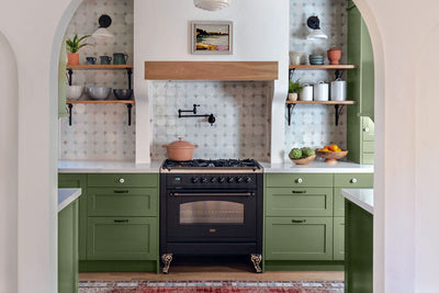
Greige is the perfect in-between neutral, extremely versatile and warm and a beautiful complement to any type of decor. For that reason, it’s another one of our founder’s faves. “What do you get when you combine two perfect neutrals like gray and beige? A color that feels completely interesting but still timeless,” she says. “The perfect color for kitchen cabinets, it offers a different take on a white kitchen but will stand the test of time.”
The Best Beige Neutral: Beigeing

“Adding warmth to your space with the help of this modern take on classic beige,” suggests Nicole. “Plus, it’s dynamic enough that it will work with both cool and warm toned colors too.”
Tags:
We make paint shopping simple with curated colors, zero VOC paint and everything you need to create a home you love, delivered.